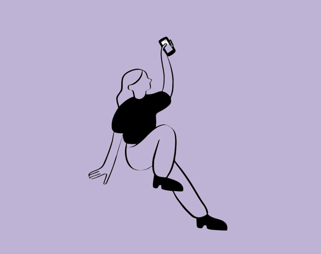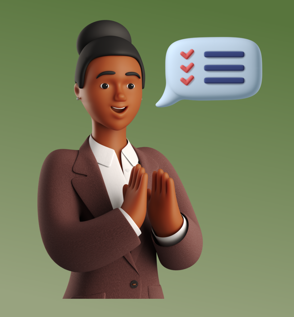
Person icons are pivotal in enhancing user interfaces by providing intuitive navigation cues and representing user interactions efficiently. This article explores how to craft effective person icons and integrate them creatively into your web designs, with insights from Icons8, a leader in design resources.
Understanding Person Icons
Person icons are graphical representations used to signify human elements, such as profiles, social interactions, or team structures. Their primary role is to facilitate user interaction by offering visual simplicity and familiarity.

Design Principles for Person Icons
- Simplicity and Clarity: Ensure your icons are simple enough to be understood at a glance. Avoid unnecessary details that might clutter the icon and confuse users.
- Consistency in Style and Color: Align your person icons with your website’s overall design language. Consistent use of style and color reinforces brand recognition and enhances user experience.
- Scalability and Visibility: Icons should be legible at any size. Design with different display scenarios in mind, ensuring clarity both in large formats and when scaled down to smaller sizes.
Creative Tips for Unique Person Icons
- Incorporating Brand Identity: Tailor person icons to reflect your brand’s personality. This could mean adopting brand colors or integrating subtle design elements that echo your brand’s theme.
- Using Color to Convey Status or Role: Utilize color coding within your icons to differentiate user roles—like administrators versus regular users—or to indicate status updates in social interactions.
- Animated vs. Static Icons: Decide between animated or static icons based on the context of use. Animated icons can be effective in drawing attention or demonstrating an action, whereas static icons are better suited for clarity and faster loading times.

Technical Considerations
- File Formats and Optimization: Use appropriate file formats like SVG for scalability and PNG for detailed designs. Optimize icons for quick loading without compromising on quality.
- Accessibility Features: Enhance accessibility by including alt text and ARIA labels. This ensures that all users, including those with disabilities, can navigate your website effectively.
Examples of Effective Person Icon Implementations
Review successful implementations of person icons on platforms like LinkedIn or Twitter. There, they represent network connections and user interactions, enhancing both navigation and user engagement. Icons8 provides an array of person icons that can inspire your designs and improve the user interface.
Common Mistakes to Avoid
- Overcomplicating Designs: A complex icon can detract from its purpose. Keep it simple to maintain functionality.
- Ignoring Cultural and Contextual Relevance: Be mindful of cultural differences in icon interpretation. Research and adapt icons appropriately to avoid miscommunication.
Conclusion
When designed thoughtfully, person icons can significantly boost a website’s usability and aesthetic. Icons8 offers a wealth of resources that can help designers create more effective and visually appealing icons.
Additional Resources
Explore more on icon design through Icons8’s extensive library, tutorials, and tools tailored to empower designers at every skill level.

