
Menu icons are crucial for user navigation and interface efficiency. This guide, enriched with insights from Icons8, offers practical advice for designing tool menu icons that effectively enhance user experience. By prioritizing design essentials and leveraging expert guidance, you can elevate both the functionality and aesthetic appeal of your menu icons.
Understand the Context
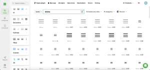
Designing effective menu icons starts with a thorough understanding of their usage context. Whether for mobile apps, web interfaces, or specialized software, knowing your platform and audience shapes the design’s complexity and style. Icons8 demonstrates how different scenarios can influence icon design, helping you tailor your creations to suit specific user needs effectively.
Clarity and Simplicity
- Focus on Function: Design icons that convey their purpose simply and clearly, using minimal elements.
- Avoid Clutter: Keep icons free of unnecessary decorative details that may obscure their meaning.
- Scale with Care: Ensure that your icons maintain clarity and visual impact at any size, a practice supported by Icons8’s scalable menu icons.
Consistency in Design
A consistent look across all menu icons facilitates a smoother user experience and promotes quick recognition. Maintain a uniform style through consistent line weights, shapes, and perspectives. Icons8 highlights the importance of a cohesive design language, which can serve as a blueprint for your own icon sets, enhancing user interface intuitiveness.
Size and Scalability
Menu icons need to be visible and distinct, regardless of size. Designing with vector formats allows for scalability without loss of detail or quality. Always consider the smallest size at which an icon will be displayed to ensure it remains effective. Icons8 advocates for regular testing across different devices to ensure these icons perform well under various conditions.
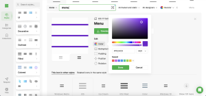
Color and Contrast
- Choose Smart Colors: Opt for colors that stand out yet integrate seamlessly with the overall design.
- Utilize High Contrast: Implement strong contrast to make menu icons easily distinguishable from their backgrounds.
- Ensure Accessibility: Select color schemes that accommodate users with visual impairments, following established accessibility standards.
Testing and Feedback
- User Engagement: Show your menu icons to the intended audience and solicit their feedback.
- Troubleshoot with Real Inputs: Use the feedback to identify and correct any issues with icon clarity or visibility.
- Refine Continuously: Adjust your designs based on this input to optimize icon effectiveness.
Tools and Resources
- Use Professional Tools: As recommended by Icons8, use advanced tools such as Adobe Illustrator for vector illustrations and Sketch for interface design.
- Leverage Icons8 Resources: Access Icons8’s extensive range of design templates and inspirational materials to kickstart your menu icon projects.
- Stay Updated: Keep up with the latest in icon design technology and trends to maintain effectiveness and relevance.
Conclusion
Creating impactful tool menu icons is both an art and a science, requiring deep understanding and thoughtful application of design principles. Emphasizing clarity, simplicity, and consistency while incorporating user feedback will significantly improve the effectiveness of your menu icons. Icons8 provides the tools, tips, and examples necessary to innovate within these parameters, helping you produce menu icons that are not only visually appealing but also functionally superb across various user interfaces.